Week 7: Introduction to Data Analysis & Visualisation
This unit will focus on creating, interpreting data and creating a visual representation of this data to make it easier for people to understand.
We will be revisiting:
and we will look at:
We will be revisiting:
- Layout Diagrams
- extracting, interpreting and exporting information and data
- Data Dictionaries
- Evaluation Criteria
and we will look at:
- Tools to create data visualisations
What is Data Visualisation?
Data visualisation is the process in which we take large amounts of data and process it into effective graphical representations that will meet needs of users or clients. Examples are: forms of charts, graphs, network diagrams.
If data visualisation is effective, it reduces the effort needed by readers to interpret information.
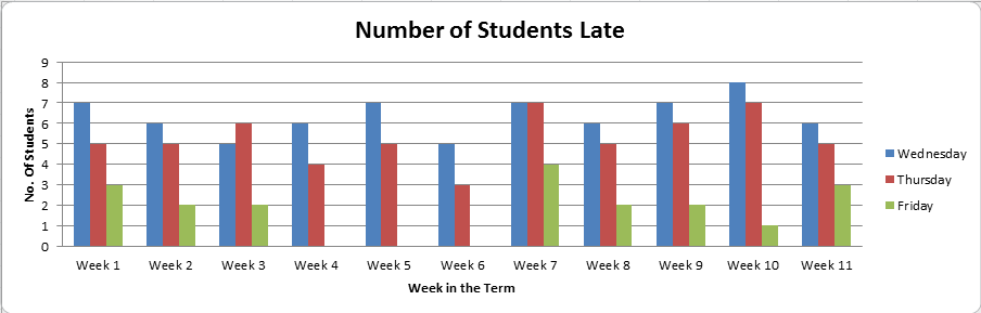
Often we use data visualisation to compare data and identify a relationship between data, for example, I can compare when students are late to class and identify a relationship between the time of day when students are late.
If data visualisation is effective, it reduces the effort needed by readers to interpret information.
Often we use data visualisation to compare data and identify a relationship between data, for example, I can compare when students are late to class and identify a relationship between the time of day when students are late.
Even though sometimes simplicity can get your point across, there are better ways to engage and communicate data and information across to your audience.
You will not be using excel to create your data visualisations this time, even though your may be using it to collect and manipulate data.
Let's begin by watching this video to give you a better understanding of how representing data can be important:
http://vceit.weebly.com/visualisations.html
You will not be using excel to create your data visualisations this time, even though your may be using it to collect and manipulate data.
Let's begin by watching this video to give you a better understanding of how representing data can be important:
http://vceit.weebly.com/visualisations.html
Examples of Effective Informatics or Data Visualisations:
Below are more examples of Data Visualisations, to give you an indication of what can be effective.
Some more interesting interactive data visualisations:
www.informationisbeautiful.net/visualizations/common-mythconceptions/
www.informationisbeautiful.net/visualizations/the-internet-of-things-a-primer/
http://www.simile-widgets.org/exhibit/
https://www.visualizefree.com/#works
www.informationisbeautiful.net/visualizations/common-mythconceptions/
www.informationisbeautiful.net/visualizations/the-internet-of-things-a-primer/
http://www.simile-widgets.org/exhibit/
https://www.visualizefree.com/#works
We've looked at these before at the beginning of the year, but you will be using this for this outcome.
For the rest of the class you will look at at least 3 different types of different tools to create a data visualisation and then start Task 1.
Note:
For the rest of the class you will look at at least 3 different types of different tools to create a data visualisation and then start Task 1.
Note:
- Most you will need to register for.
- Ensure that if you choose one of the below that you have a save option to save your work and data visualisation.
http://visualizefree.com/
http://www.betterworldflux.com/
http://opendata-tools.org/en/visualization/
http://piktochart.com/
plot.ly/
infogram.com/
Other options:
Photoshop
Illustrator
http://www.betterworldflux.com/
http://opendata-tools.org/en/visualization/
http://piktochart.com/
plot.ly/
infogram.com/
Other options:
Photoshop
Illustrator
Task 1:
Research a topic of your choice and create an infographic to present to the class.
1) Collect at least 10 statistics on your chosen topic (topics must be approved)
2) Present the data in a unique and engaging way
3) Clear and relevant information
Some ideas if you are stuck:
Submit your visualisation through compass under Data Analysis & Visualisation: Task 1 - next class we will be presenting, so ensure that you are completing your work to present.
1) Collect at least 10 statistics on your chosen topic (topics must be approved)
2) Present the data in a unique and engaging way
3) Clear and relevant information
Some ideas if you are stuck:
- Habits of Successful Students
- Palm Oil and Deforestation
- Student's online/phone habits
Submit your visualisation through compass under Data Analysis & Visualisation: Task 1 - next class we will be presenting, so ensure that you are completing your work to present.
Data Integrity
Last class you collected data through different statistic in order to produce your data visualisation or informatic.
Today, we will look at an important concept to remember and note when using data, through what is known as Data Integrity.
Today, we will look at an important concept to remember and note when using data, through what is known as Data Integrity.
Write down the following questions to answer while you watch the video/s below:
Video 1:
1) What is data integrity?
2) What are 3 different types of data integrity errors?
3) Describe each.
4) Which error is the hardest to identify?
Video 2:
1) What are the 5 misconceptions? Give examples of what could occur to diminish the integrity of data instead.
2) In Misconception 1, what does the company need to ensure about the data?
3) Finally, why is data integrity SO important??
The 4 main key areas of data integrity are:
1) Accuracy of data.
Data Validation can be used in order to restrict the types of data received to avoid or minimize errors. Such as....
The use of checkboxes or drop down menus instead of typing in information.
1) Accuracy of data.
Data Validation can be used in order to restrict the types of data received to avoid or minimize errors. Such as....
The use of checkboxes or drop down menus instead of typing in information.
2) Timeliness of Data - is the data up to date.
How relevant is a house that sold in Newport 10 years ago to a house selling today?
How relevant is a house that sold in Newport 10 years ago to a house selling today?
3) Authenticity - how genuine is the data?
Can you rely on wikipedia all they time? Is the source trustworthy, reliable and accurate?
Can you rely on wikipedia all they time? Is the source trustworthy, reliable and accurate?
4) Relevance
Does the data contribute to producing the information required?
Does the data contribute to producing the information required?
Task 2:
Consider the following scenario:
You work for a start up company that wants to develop a world wide based newspaper App.
You are to investigate the use of the mobile phone internet usage within countries.
1.What possible reasons can you think of to investigate into this data?
2.What data would you need to source for this investigate?
3.Where will you source your data from?
4.What factors would influence the data integrity of data collected in reference to the scenario?
5.What are the constraints that may limit the data visualisation you will create. (Remember Constraints are limitation or boundaries to a solution).
